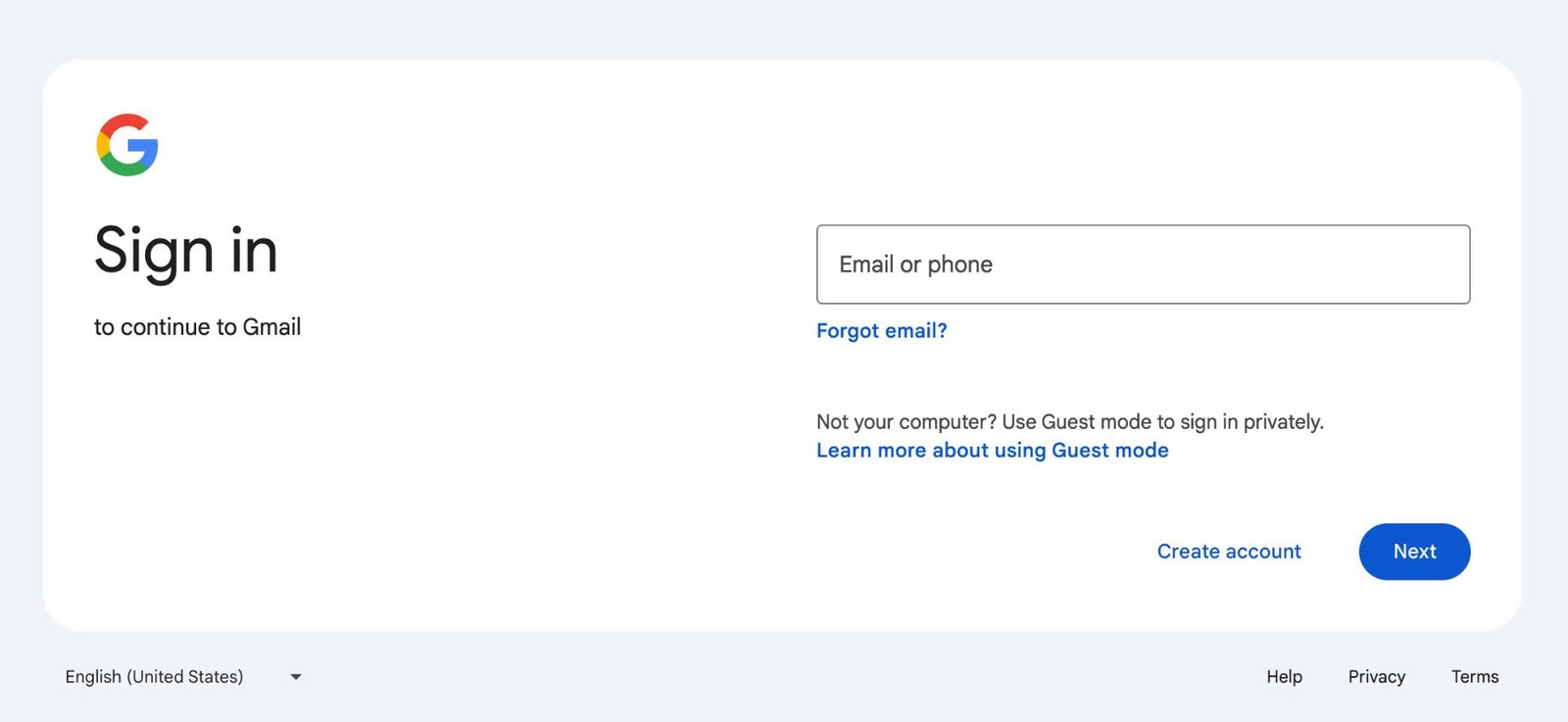
In the ever-evolving digital landscape, user interfaces play a pivotal role in shaping our online experiences. Recently, Gmail unveiled its revamped sign-in page, sporting a sleek and contemporary design.
Let’s explore into the details and explore what this update means for users.
Gone are the days of the plain, utilitarian sign-in screens. Gmail’s fresh interface embraces the principles of Material Design, harmonizing it with other Google products. Here’s what you’ll notice:
The new sign-in page features gentle curves and a palette that soothes the eyes. It’s a departure from the starkness of yesteryears.
Instead of centering everything, Gmail now places the “Email or phone” field to the right of the Google logo and the “Sign in” header. It’s a subtle shift that enhances visual balance.
Say goodbye to the rectangular “Next” button. Gmail adopts a pill-shaped button, making it more inviting and touch-friendly.

Fear not, dear Gmail aficionados! While the aesthetics have undergone a facelift, the underlying functionality remains intact. You’ll still access your inbox, compose emails, and manage labels seamlessly. This update is all about enhancing the user experience without disrupting the familiar flow.
Why It Matters
1. Consistency: By aligning with Material Design, Gmail ensures a consistent look across its suite of services. Whether you’re using Google Drive, Calendar, or Photos, the visual language remains cohesive.
2. First Impressions: The sign-in page is often the gateway to our digital lives. A polished, modern design sets the tone for what lies beyond. It’s like a well-designed foyer—inviting and reassuring.
3. Accessibility: The layout adjustments cater to various screen sizes, making Gmail more accessible on both desktop and mobile devices.
Early reactions have been positive. Users appreciate the cleaner aesthetics and the subtle refinements. Some even liken it to stepping into a freshly renovated home—familiar yet rejuvenated.
Gmail’s new sign-in page is more than just a cosmetic upgrade. It’s a nod to the importance of design in our daily interactions. So, next time you log in, take a moment to appreciate the thoughtfulness behind those rounded corners and that pill-shaped button. After all, even in the digital realm, aesthetics matter.
Disclaimer: The opinions expressed in this article are solely those of the author and do not reflect the official stance of Gmail or Google.


