Cascading Style Sheets (CSS) is a fundamental part of modern web development. It is used to control the presentation and layout of web pages. CSS properties are used to define how elements on a web page are styled and positioned.
In this article, we will explore the most important CSS properties that every developer should know.
- Box-sizing
- Fonts (rem, em)
- Padding & Margins
- Display
- Position
- Width & Height
- Max-width
- Border
- Z-index
- Overflow
- Pseudo-classes
- Pseudo-element
- Flexbox
- Grid
- Transitions
- Animation
- Media Queries
1. Box-sizing
The box-sizing property is used to specify whether an element’s width and height include its padding and border. This property can have two values: content-box (default) and border-box. When the value is set to border-box, the width and height of the element include the padding and border.
2. Fonts (rem, em)
The font property is used to specify the font size, family, and style of text. The font-size can be specified using units like pixels, em, or rem. Em and rem units are relative units that are based on the font size of the parent element. Rem units are based on the root font size, while em units are based on the current font size of the element.
3. Padding & Margins
Padding and margins are used to create space around elements. The padding property is used to add space inside an element, while the margin property is used to add space outside an element.
4. Display
The display property is used to control how an element is displayed on the web page. The most common values for this property are block, inline, and inline-block. The display property also controls the box model for an element, which determines how an element’s content is positioned and sized.
5. Position
The position property is used to control the position of an element on the web page. This property can have several values, including static, relative, absolute, and fixed. The position property also interacts with other properties, such as top, bottom, left, and right, which are used to specify the exact position of an element.
6. Width & Height
The width and height properties are used to set the size of an element. These properties can be specified in units like pixels, em, or percent.
7. Max-width
The max-width property is used to set the maximum width of an element. This property is commonly used in responsive web design to ensure that elements do not exceed a certain width on smaller screens.
8. Border
The border property is used to create a border around an element. This property can be used to set the width, style, and color of a border.
9. Z-index
The z-index property is used to control the stacking order of elements on a web page. This property can be used to specify which elements should be displayed on top of others.
10. Overflow
The overflow property is used to control what happens when an element’s content exceeds its size. This property can have several values, including visible, hidden, scroll, and auto.
11. Pseudo-classes
Pseudo-classes are used to select and style elements based on their state or position. Some common pseudo-classes include :hover, :active, and :focus.
12. Pseudo-element
Pseudo-elements are used to add content to an element that is not part of the HTML. Common pseudo-elements include ::before and ::after.
13. Flexbox
Flexbox is a layout system that is used to control the positioning and alignment of elements. It is commonly used in responsive web design to create flexible and adaptable layouts.
14. Grid
Grid is another layout system that is used to control the positioning and alignment of elements. It is more complex than flexbox but offers more control over the layout of the web page.
15. Transitions
Transitions are used to add animation effects to elements when a property changes. This property can be used to create smooth and subtle transitions between different states or positions of an element.
16. Animation
The animation property is used to create more complex and advanced animations on web pages. It allows developers to specify multiple steps of animation and add timing and easing functions to create more dynamic and interactive effects.
17. Media Queries
Media queries are used to apply different styles to elements based on the screen size or device type. This allows developers to create responsive web pages that adapt to different screen sizes and devices.
These are some of the most important CSS properties that every developer should know. By mastering these properties, you can create beautiful and responsive web pages that are optimized for different devices and screen sizes. CSS is a powerful tool for web development, and understanding these properties is essential for any developer who wants to create high-quality web pages.
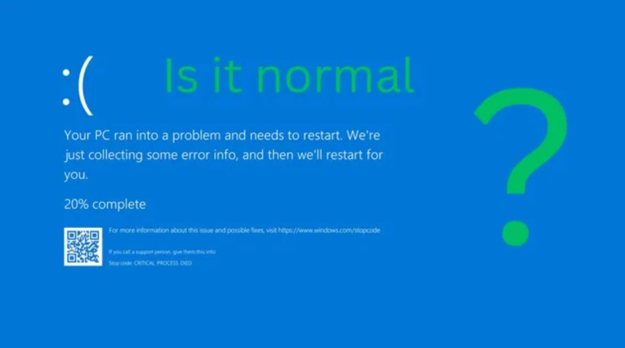
You may also like:- How To Fix the Crowdstrike/BSOD Issue in Microsoft Windows
- MICROSOFT is Down Worldwide – Read Full Story
- Windows Showing Blue Screen Of Death Error? Here’s How You Can Fix It
- A Guide to SQL Operations: Selecting, Inserting, Updating, Deleting, Grouping, Ordering, Joining, and Using UNION
- Top 10 Most Common Software Vulnerabilities
- Essential Log Types for Effective SIEM Deployment
- How to Fix the VMware Workstation Error: “Unable to open kernel device ‘.\VMCIDev\VMX'”
- Top 3 Process Monitoring Tools for Malware Analysis
- CVE-2024-6387 – Critical OpenSSH Unauthenticated RCE Flaw ‘regreSSHion’ Exposes Millions of Linux Systems
- 22 Most Widely Used Testing Tools