Data visualization is one of the most powerful tools an analyst has for two main reasons.
Firstly, it is matchless in its ability to guide the analyst’s hand in determining “what to look at next.” Often, a visual is revealing of patterns in the data that are not easily visible by just looking at Data Frames. Secondly, they are an analyst’s greatest communication tool. Professional analysts need to present their results to groups of people responsible for acting based on what the data says.
Visuals can tell your story much better than raw numbers.
Types of Charts
Knowing which chart to use is important in presenting your data properly. We’ll go over several charts today; however, these are some of the common charts you’ll want to know:
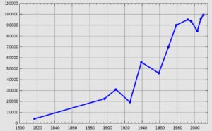
1. Line Chart
Exploring data over time
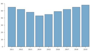
2. Bar Chart
Comparing categories of data and tracks changes over time
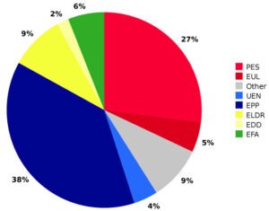
3. Pie Chart
Explores parts of a whole, that is, fractions
4. Scatter Plot
Like line charts, tracks correlations between two categories

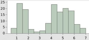
5. Histogram
Unrelated from bar charts, shows distribution of variables
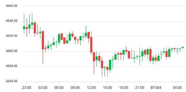
6. Candlestick Chart
Used a lot in financial sector, that is, can compare a stock over a period
7. Box Chart
Looks identical to candlestick charts, and compares minimum, 1st, median, 3rd quartiles, and max values

Depending on what you need to accomplish in conceptualizing your data, you will be able to choose a specific type of chart to portray your data.
You may also like:- How To Fix the Crowdstrike/BSOD Issue in Microsoft Windows
- MICROSOFT is Down Worldwide – Read Full Story
- Windows Showing Blue Screen Of Death Error? Here’s How You Can Fix It
- A Guide to SQL Operations: Selecting, Inserting, Updating, Deleting, Grouping, Ordering, Joining, and Using UNION
- Top 10 Most Common Software Vulnerabilities
- Essential Log Types for Effective SIEM Deployment
- How to Fix the VMware Workstation Error: “Unable to open kernel device ‘.\VMCIDev\VMX'”
- Top 3 Process Monitoring Tools for Malware Analysis
- CVE-2024-6387 – Critical OpenSSH Unauthenticated RCE Flaw ‘regreSSHion’ Exposes Millions of Linux Systems
- 22 Most Widely Used Testing Tools